For this project, the task was to rebrand a performance of Macbeth in whatever style we wanted. The outcome was a test of branding skills and taught me what branding identity looks like as well as what the idea generation process consists of. I followed a more wiccan-inspired reimagination of the playwright using its original spelling.
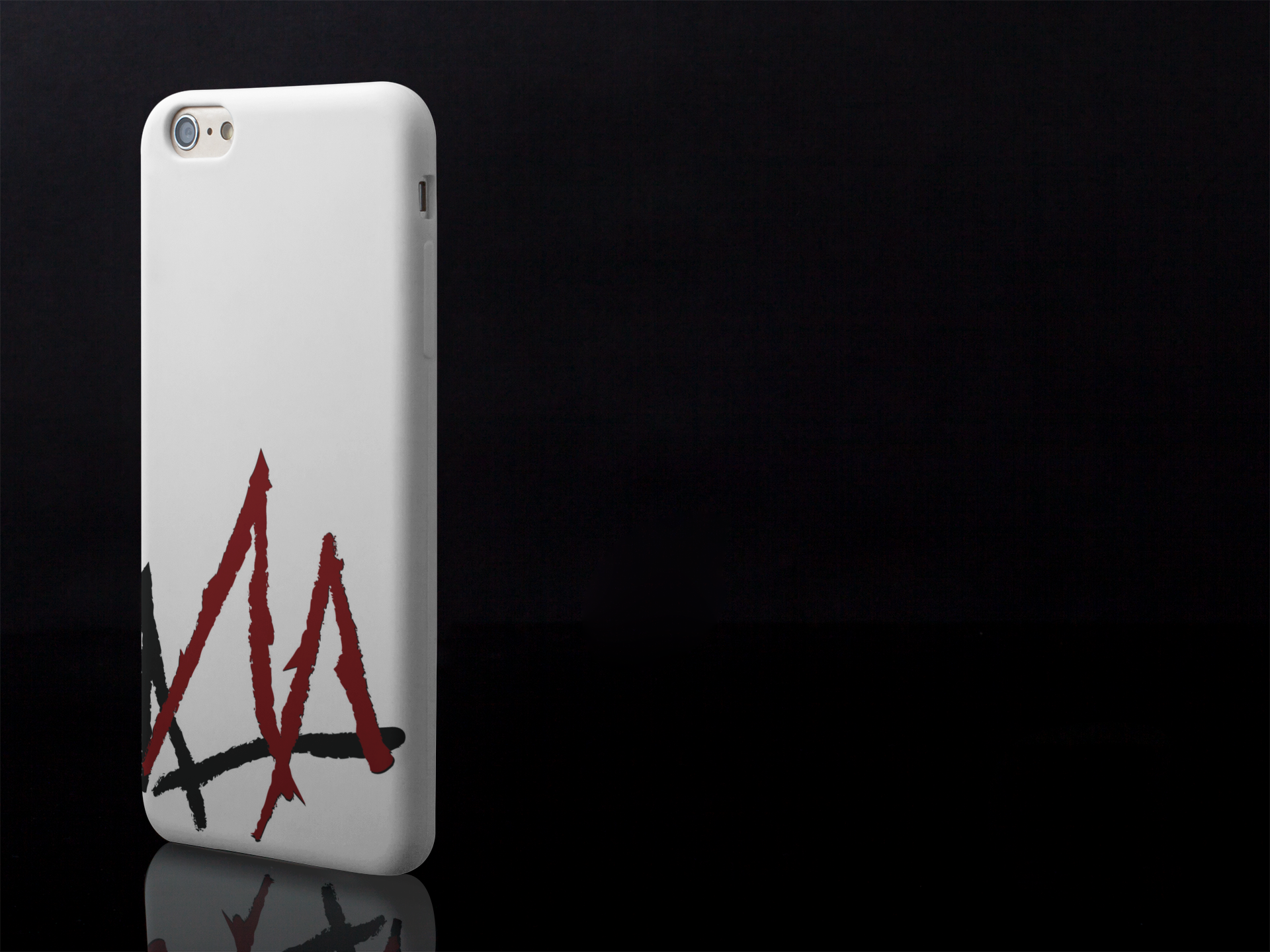
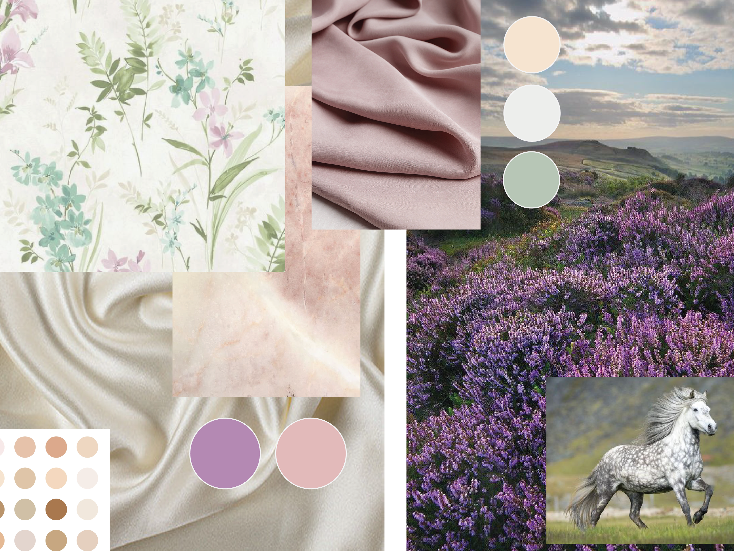
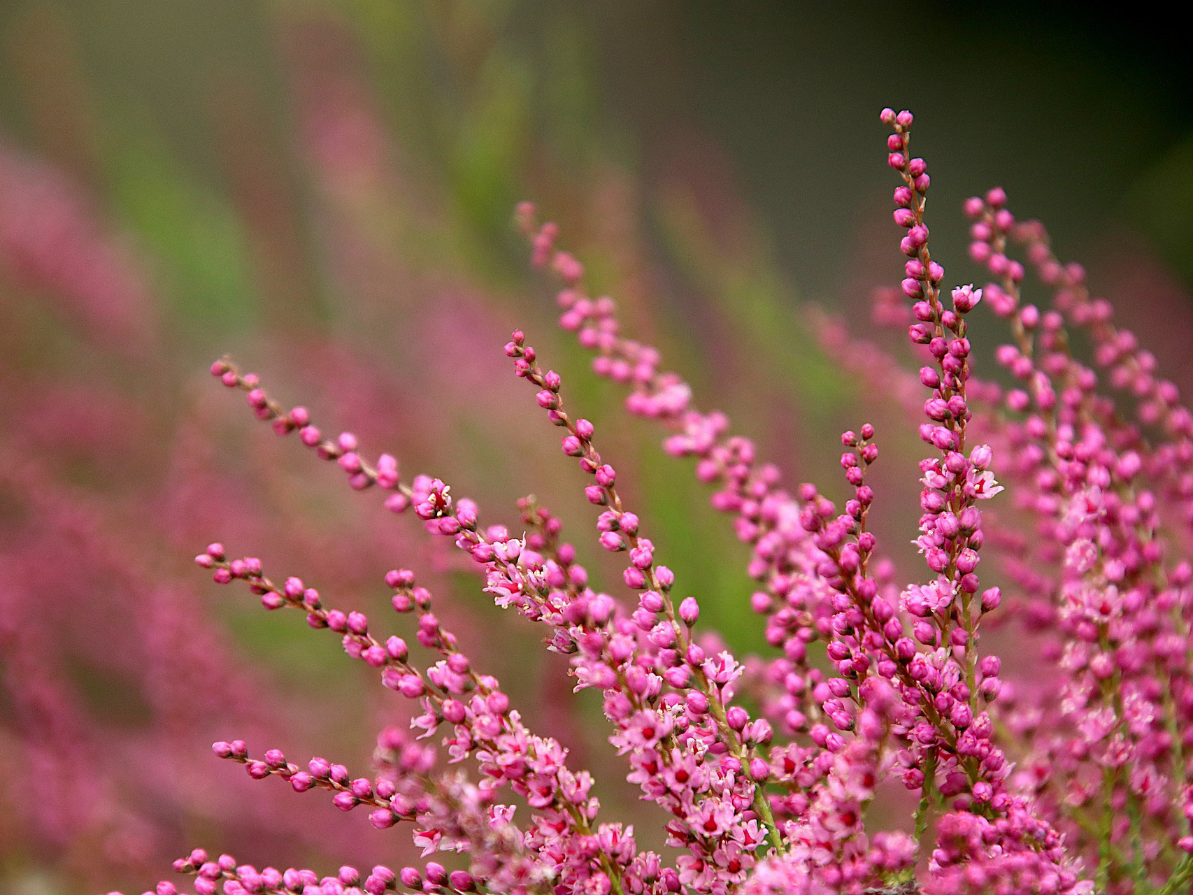
It was a goal of mine to incorporate nature-themed inspiration into my final product, but at first glance it appeared limiting given the subject matter. I was able to use the supernatural element of the story to fuel that, the three witches in the beginning of the story were easy to relate to modern-day witches, called wiccas. All witch magic, beit make-believe or real, revolves around the appreciation and incorporation of nature. A more mainstream wiccan trick is to follow a code system to turn an intention into a rune symbol, my production logo is the rune translation of an important line of dialogue from the story. I recreated the symbol using twigs, a natural element, and then manipulated the pieces so the rune as a whole slightly resembled a crown, refrencing the main character of the play. We had to create a series of auxilary items to accompany the brand, as well as a brand specifications book and logo variations.
The biggest challenge was making a product that fit within very tight guidelines, learning to create something you are proud of while also fulfilling the wishes of a client was hard to balance at first but a very good lesson to learn. While corporate branding and identity may not be my cup of tea, streamlining a brand into a single image that represents the many facets of a company, event, or production, is something I found really intriguing.
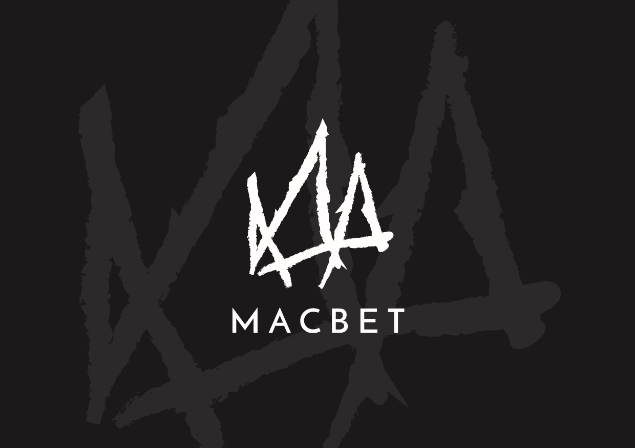
Logo
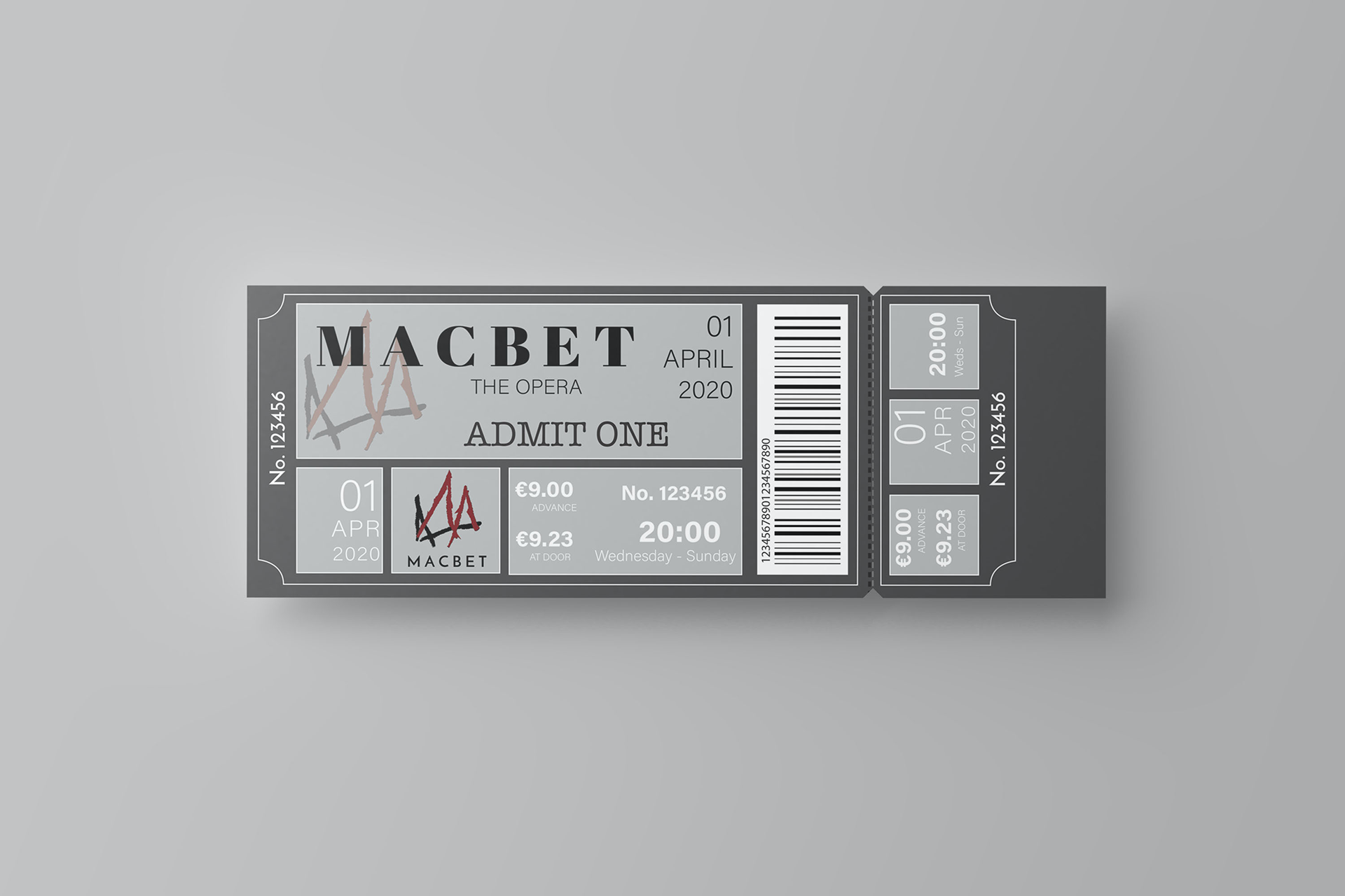
Ticket
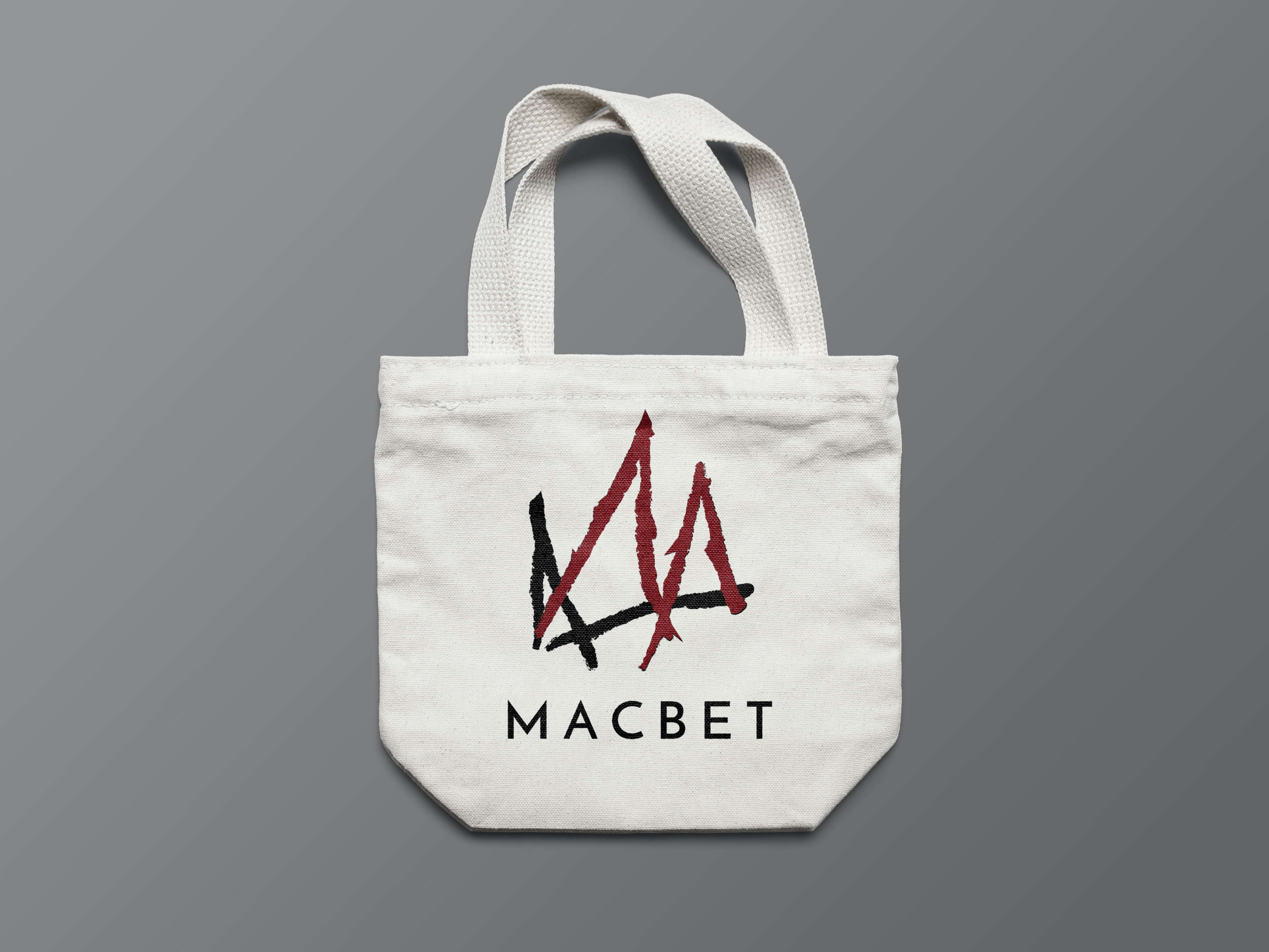
Tote bag
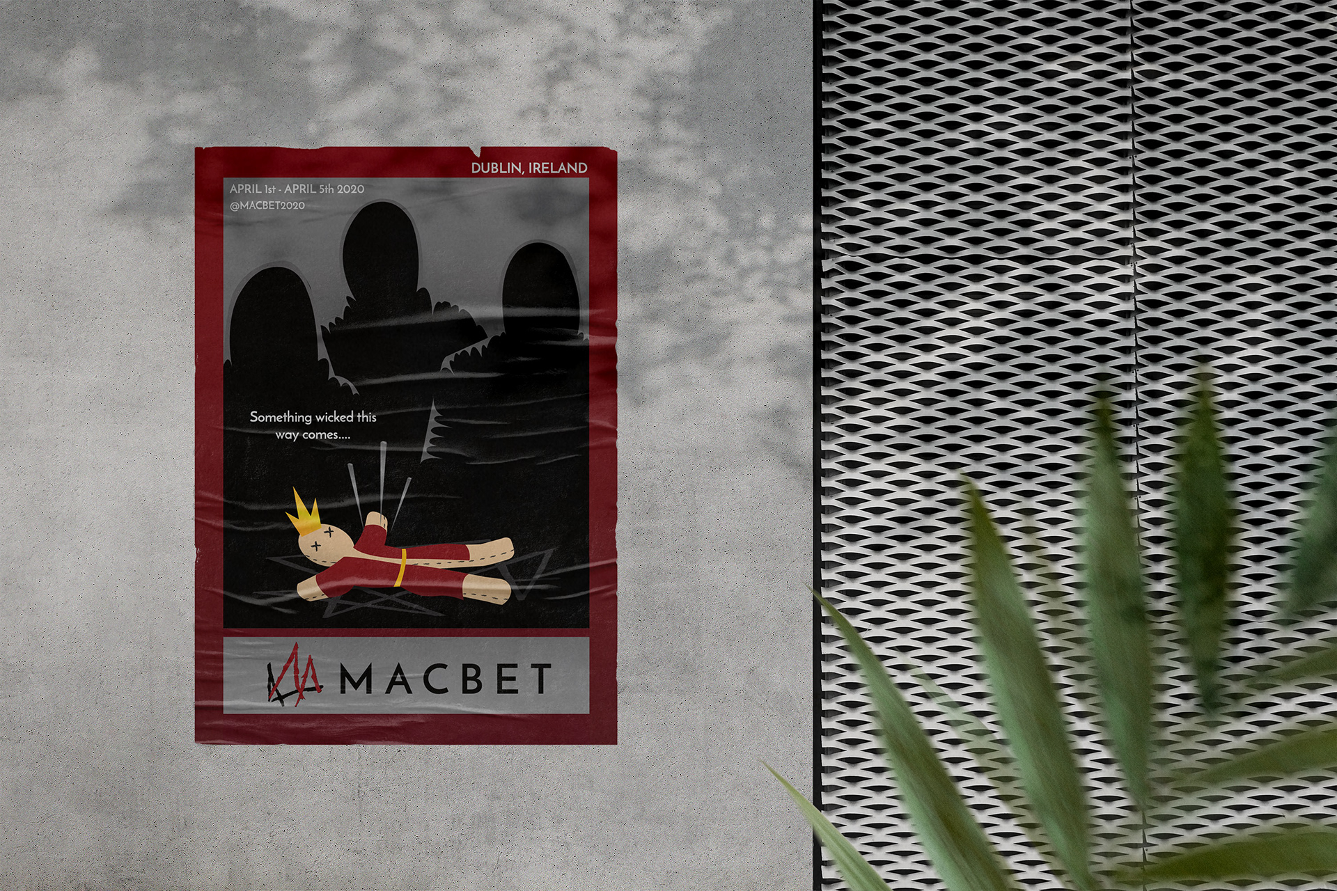
Poster
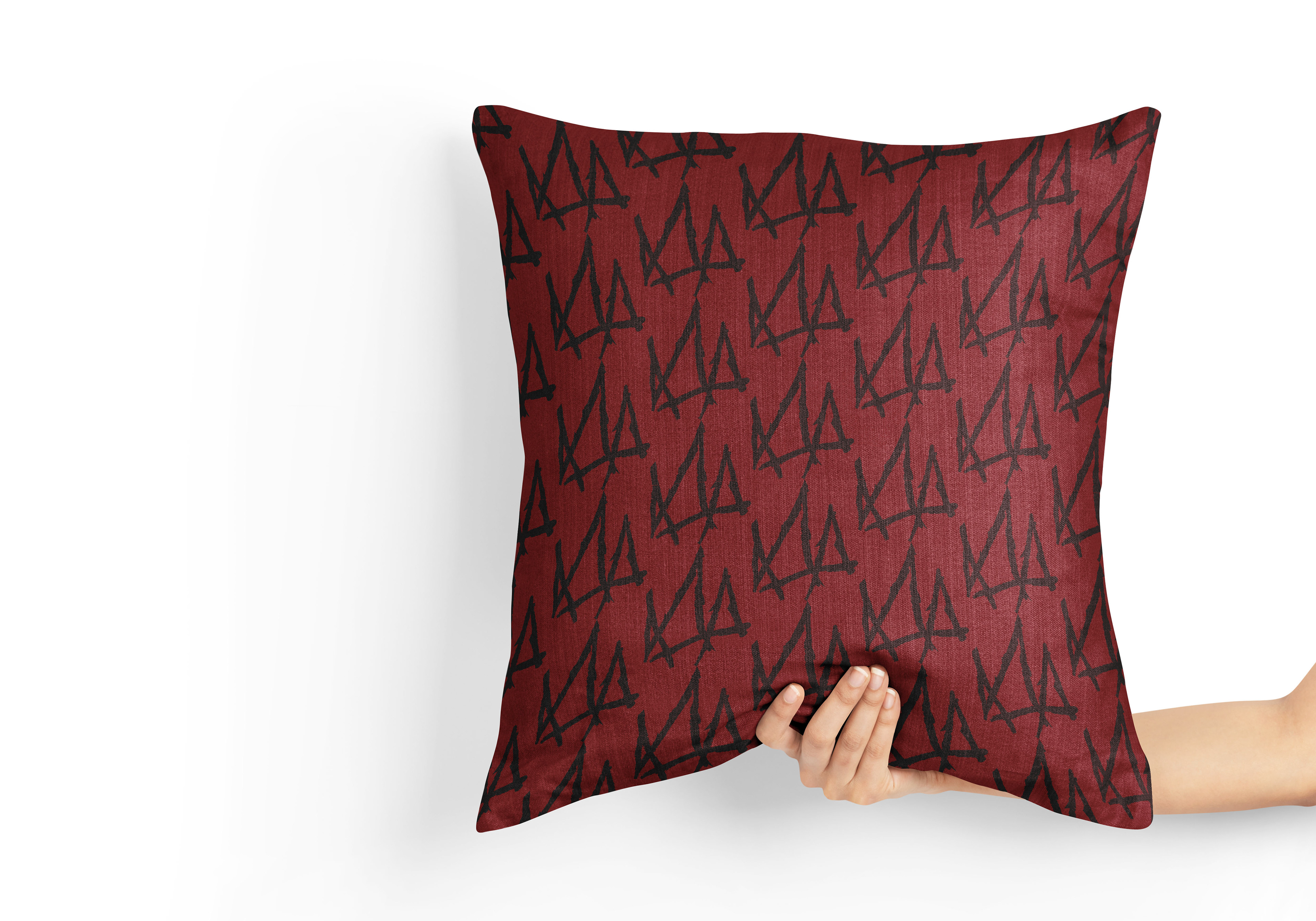
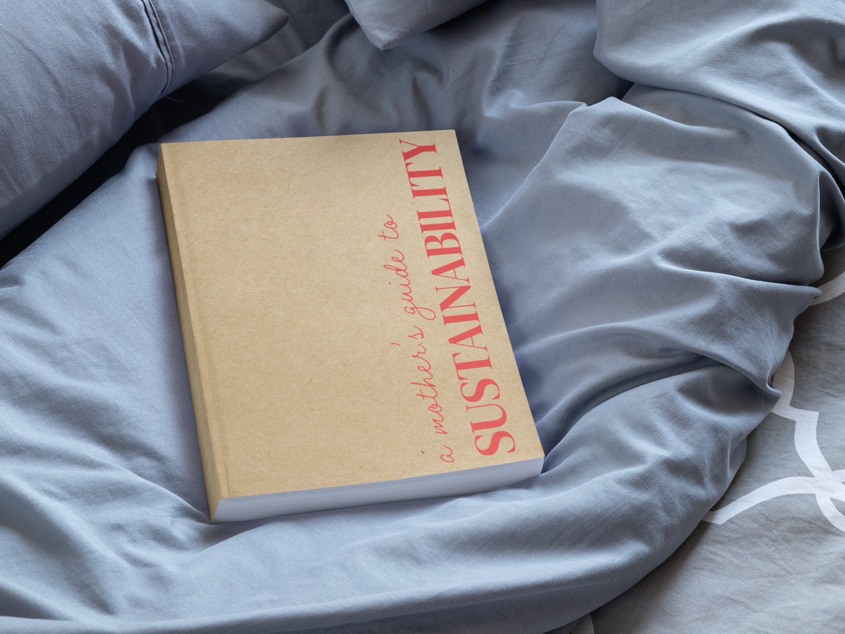
Pillow